

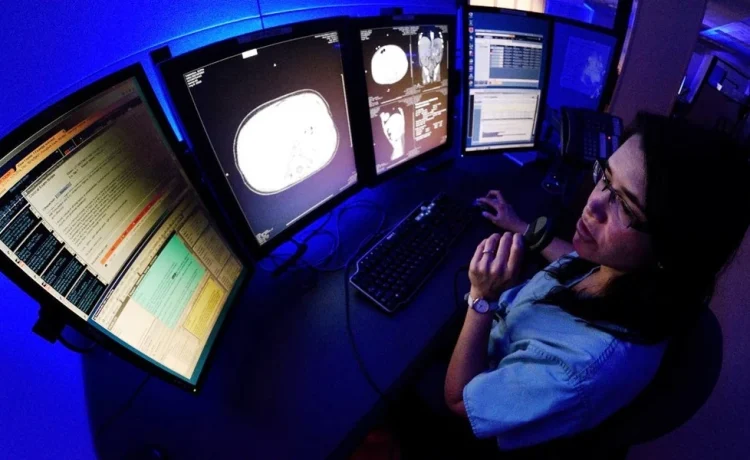
Most reading rooms get built around whatever fits the floor plan. The monitors go where the outlets are. The desks come from a catalog that had something in stock. Then everyone wonders why the radiologist is rubbing their neck by 2 p.m. and re-reading the same chest CT twice.
Here’s the honest version: reading room design isn’t a furniture decision. It’s a diagnostic accuracy decision that happens to involve furniture. How you arrange monitors, lighting, and seating determines how long a radiologist can sustain sharp visual attention, and that determines how many studies get read well in a shift.
The fix isn’t complicated, but it does require planning that most facilities skip. It starts with treating the workstation as clinical equipment rather than office furniture. That’s why radiology groups increasingly spec out ergonomic radiology workstations the same way they spec a scanner: by measuring what the user actually does for eight hours, then building to that.
Why does a reading room wear people down so fast?
Radiology is one of the few jobs where the entire task is staring, comparing, and deciding. There’s no walking to a conference room, no reset between cases. The eyes stay locked at a fixed distance, the neck holds one angle, and the shoulders creep up toward the ears over the course of a shift.
According to the Occupational Safety and Health Administration, workstation design factors like monitor height, viewing distance, and seating adjustment are recognized contributors to musculoskeletal strain in prolonged computer work. Radiology stacks several of those factors on top of each other because the monitor count is higher and the seating is more static than a typical office desk job.
I’ve walked through reading rooms where the primary monitor sat six inches lower than the secondary bank. The radiologist had compensated by tilting their head down and holding it there. Nobody designed that posture on purpose. It just happened because the arms holding the monitors were bought at different times.
The three things that actually move the needle
Skip the long list of preferences. In my experience touring and planning these spaces, three variables do most of the work. Get them right and the room feels dramatically better. Get them wrong and no amount of lumbar cushioning rescues you.
Monitor geometry
Eye height should match the top third of the primary display, not the center. Viewing distance should sit at roughly an arm’s length to an arm and a half, adjusted for screen size. If a radiologist has to lean in to catch subtle density differences, the monitor is too far away, and the lean is the injury.
Light control
Ambient light should be dim enough to preserve contrast on the display but bright enough that the eyes aren’t fighting to adjust when the radiologist looks away to type or talk. Adjustable fixtures beat a single dimmer switch, because a room reading mammography and a room reading trauma films want different settings.
Transition between sitting and standing
Sit-to-stand capability matters less for posture perfection and more for circulation and attention. A radiologist who can shift position without leaving the workstation resets their focus without losing their place in the worklist. That’s the whole point.
A quick way to audit your own reading room
You don’t need a consultant to spot the obvious problems. Bring a tape measure and a phone camera, and spend twenty minutes doing this during a normal reading block, not after hours.
- Photograph the seated posture from the side. Ears over shoulders, eyes level with the upper portion of the primary monitor. If the chin is tucked or the neck is craned, you’ve found your first problem.
- Measure the gap between the primary and secondary monitors. Big gaps force extra head turning, and cumulative head turning is what makes a long shift feel long.
- Check where the keyboard sits relative to the body. If the radiologist has to reach forward past their natural elbow line, the desk depth is wrong for the task.
- Ask about glare at different times of day. Morning sun through a window hits a different monitor than afternoon sun. One fixture won’t cover both.
- Watch a full case start to finish. Where do they pause, shift, stretch, or squint? Those micro-movements are your specification sheet.
Write down what you see. Photos and notes beat a memory of “the room felt cramped” when you’re six months later trying to justify a capital request.
What gets overlooked in the planning stage
Cable management is the most under-planned part of any reading room. Monitors multiply, and so do the cables feeding them. If you don’t design the routing before the desks arrive, you’ll end up with a bundle zip-tied to a leg and a foot of slack that nobody can adjust when a monitor gets swapped.
The other overlooked piece is who gets to sit at the workstation. Reading rooms serve radiologists, but they also host technologists, trainees, and occasionally a clinician who walks in to review a study. If the workstation only fits one body type and one workflow, everyone else improvises, and improvisation is where bad ergonomics come from.
There’s a broader research thread here too. The National Institutes of Health has long supported work on how physical work environment conditions affect sustained cognitive task performance, which is essentially the question a reading room is trying to answer.
You’re not chasing comfort for its own sake. You’re trying to protect the quality of decisions made in hour seven of an eight hour block. Build the room around the longest, hardest case of the day, not the easiest one.
The argument I’d make to your finance team
Reading room upgrades compete against scanners, software licenses, and staffing. They usually lose that fight because the return is hard to show on a spreadsheet. But the case is simpler than it looks.
A workstation that supports sustained attention protects throughput on every study read in that room, every day, for a decade. A workstation that doesn’t forces micro-breaks, posture resets, and re-reads that nobody ever logs as a cost. The expense is visible at purchase. The cost of a bad setup is invisible and recurring.
My advice: don’t buy a room at once and don’t chase every feature. Start with monitor geometry and light control, since those are cheap relative to everything else and they shape the daily experience most. Add adjustable height and better cable routing when the budget allows. Measure the result with the audit above, and bring the before-and-after photos to the next capital conversation. Pictures of a neck craned at a monitor tend to end debates faster than a spreadsheet ever will.
What does your reading room look like at 4 p.m. on a busy day? That’s the version worth designing for.